For a better experience, we recommend you to orientate your device
For a better experience, we recommend you to orientate your device


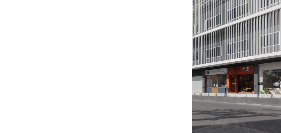
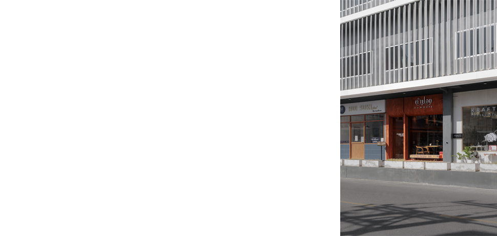
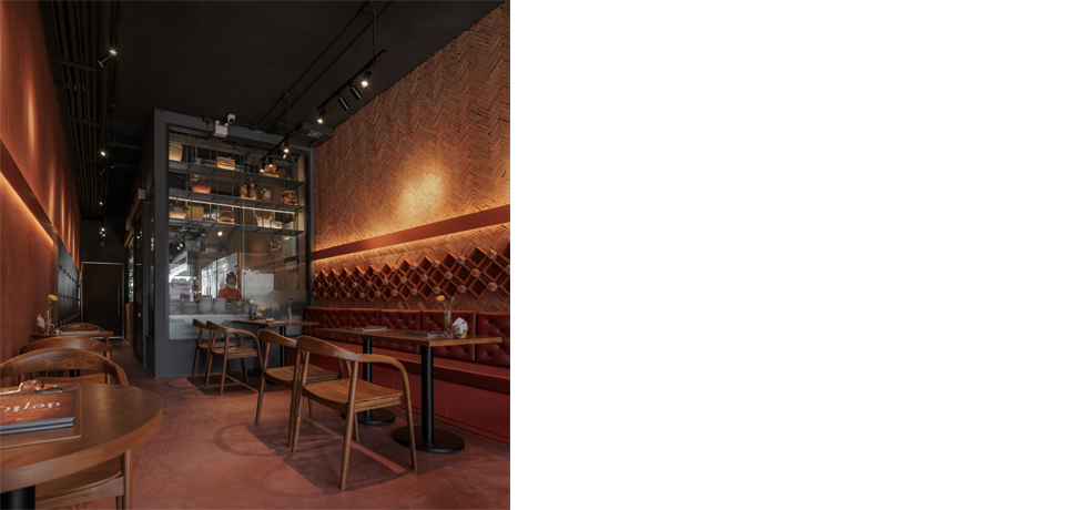
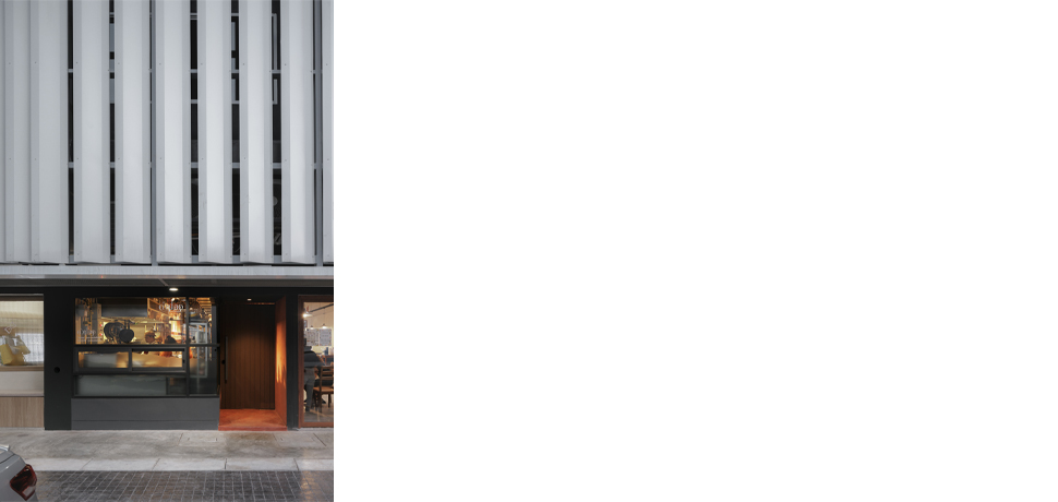
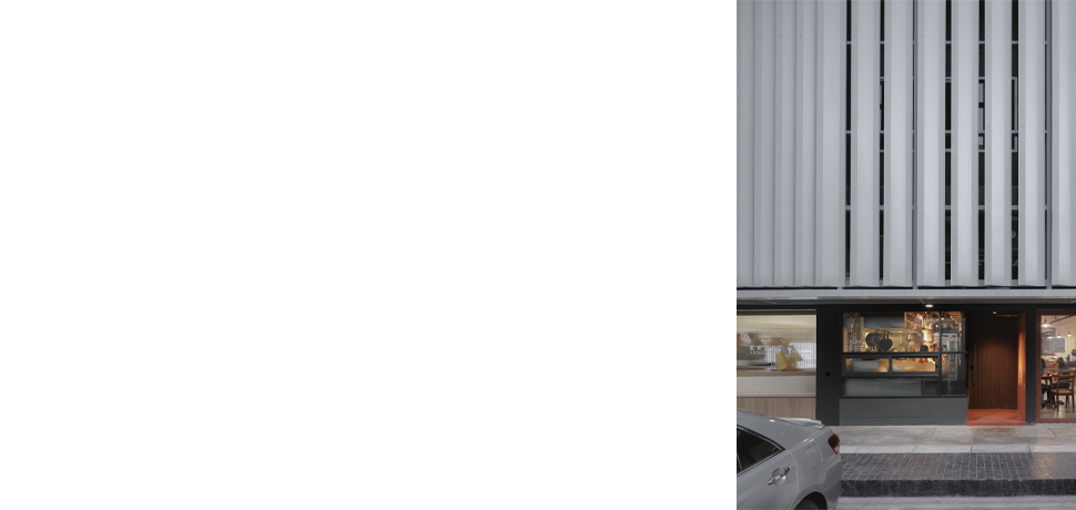
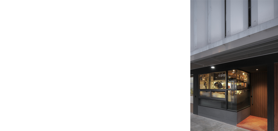
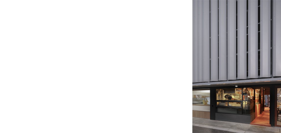
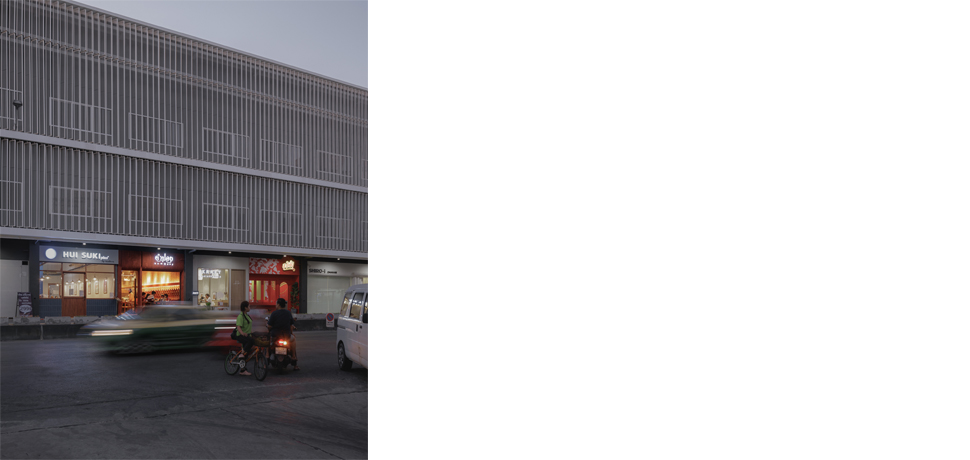
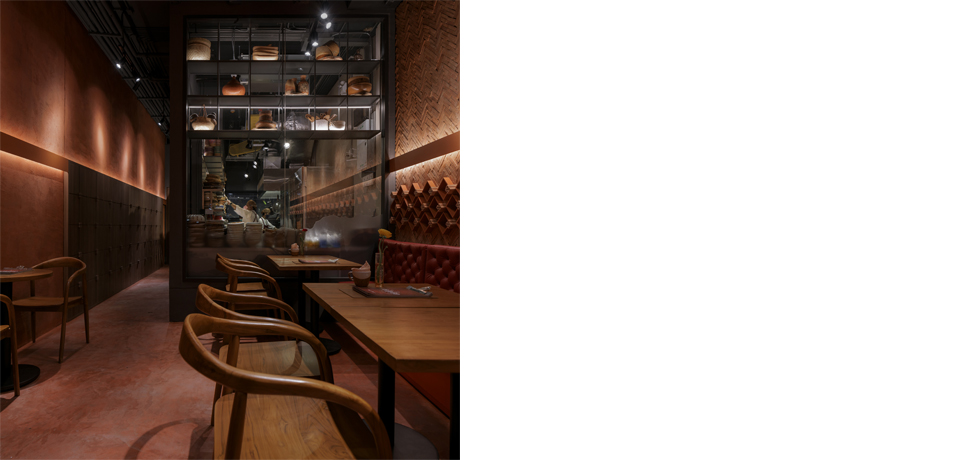
Kumpoy is the name of a restaurant founded by the owner, whose nickname also inspired the project’s identity. Growing up near a kitchen stove,
she learned to cook from family recipes and developed a passion for experimenting with ingredients, particularly in creating bold, spicy dishes.
While traditional northern Thai cuisine is often described as mild and sweet, the food at Kumpoy offers a distinctive twist
—flavors that are bold, sour, and spicy, reinterpreting the northern palate with originality.
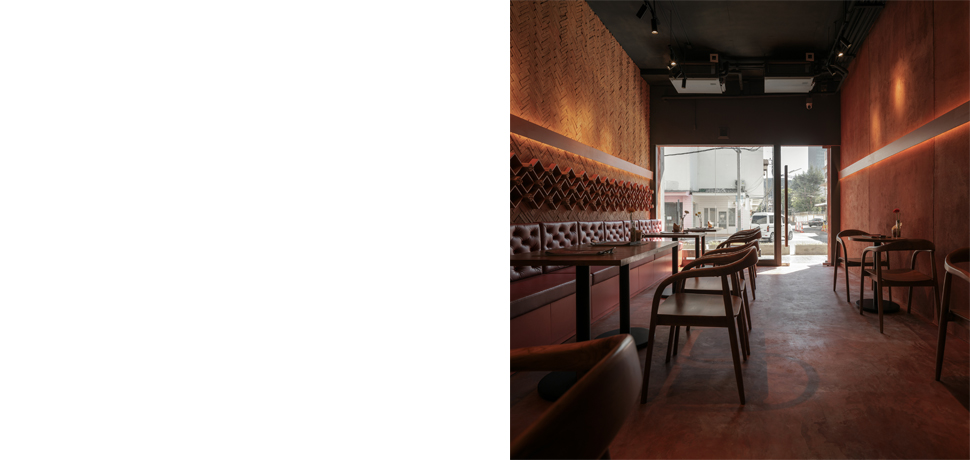
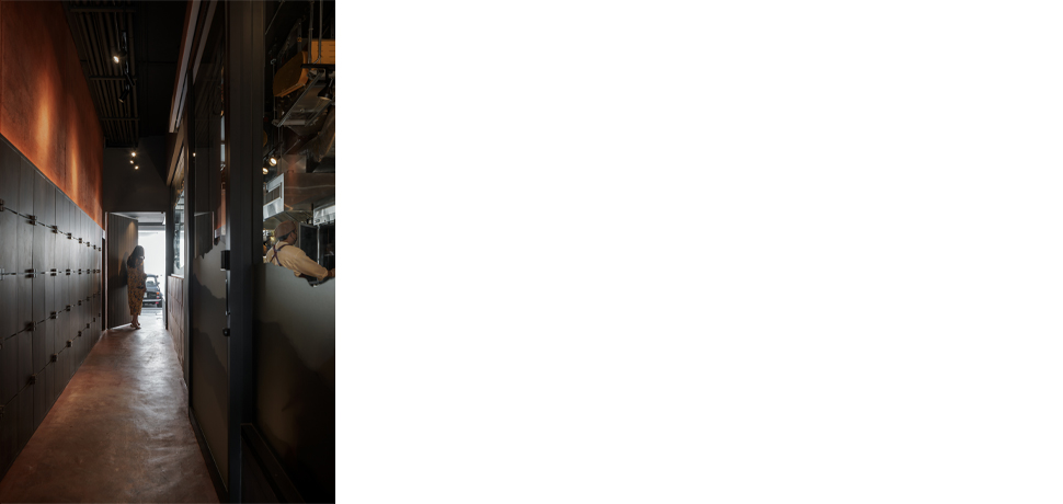
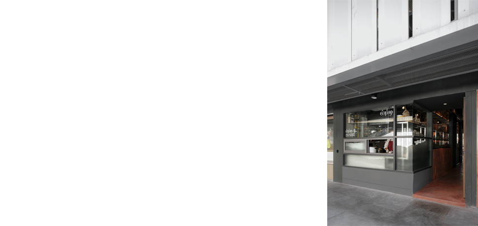
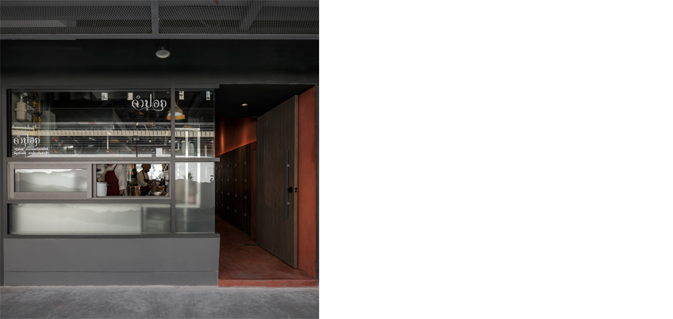
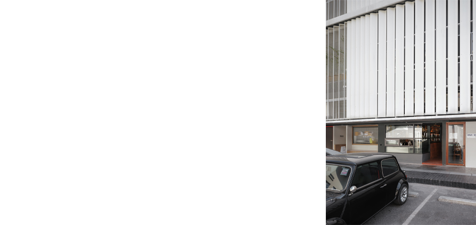
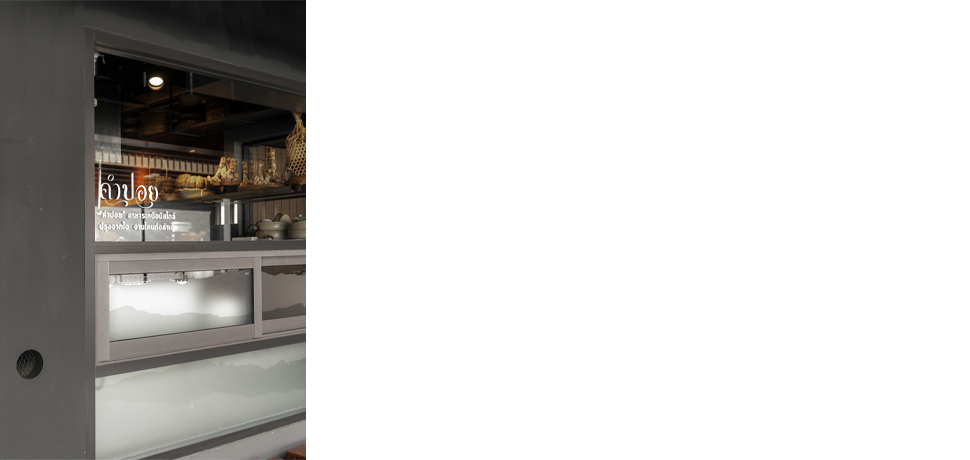
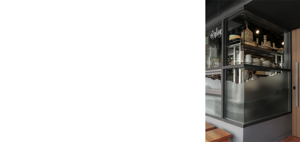
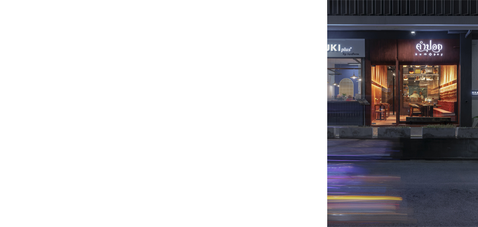
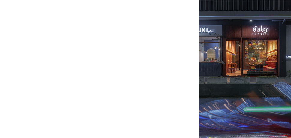
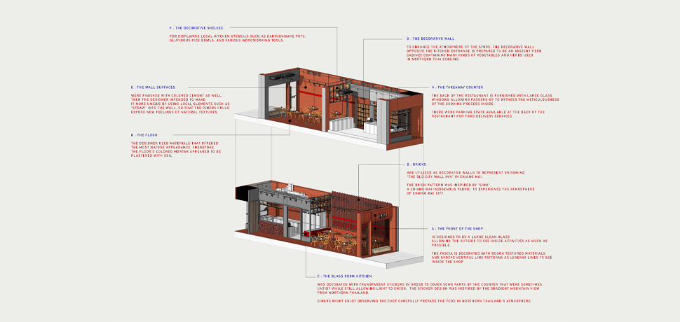
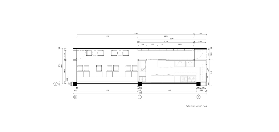
The interior design reflects the owner’s personality, heritage, and culinary vision. The restaurant’s main entrance faces the public road, with expansive glass
panels that invite passersby to look inside. At the back, the kitchen is placed along the internal road within the Block 28 project and features large glass
windows—both to showcase the cooking process and to support future delivery services. The overall ambiance draws inspiration from the owner’s Chiang Mai
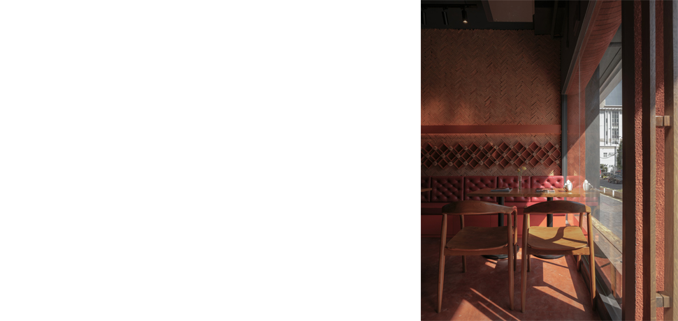
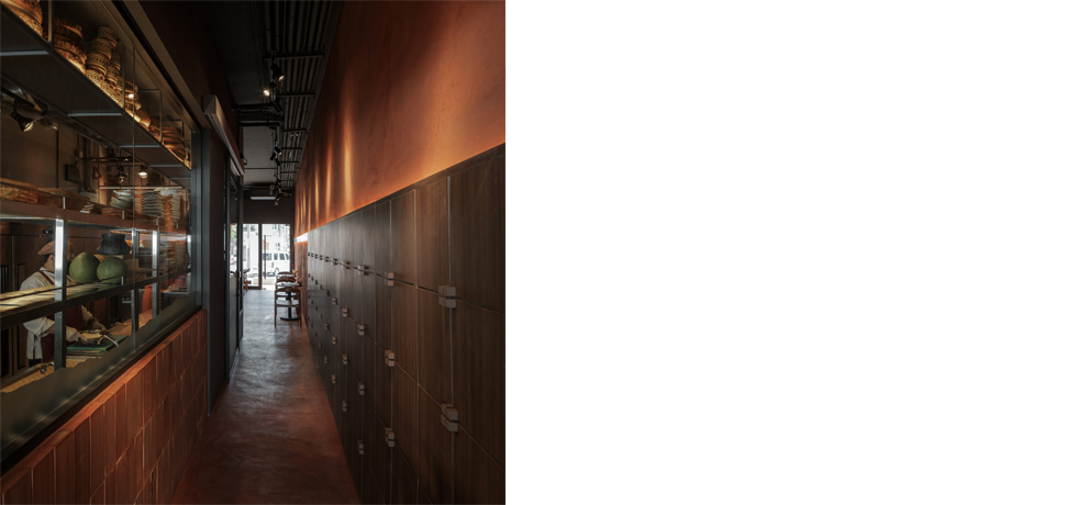
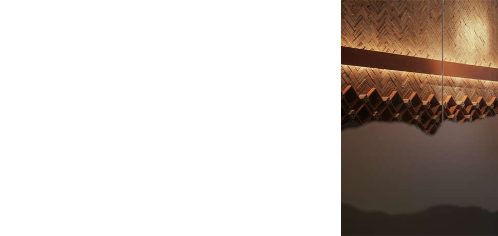
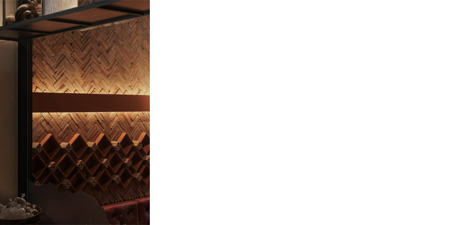
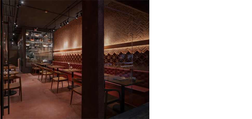
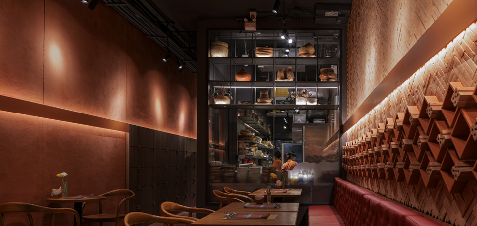
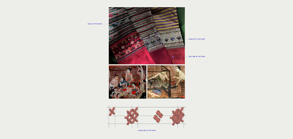
roots and her commitment to quality ingredients. Brick walls reference Chiang Mai’s historic city walls, while being rearranged in modern patterns inspired
by “Sinh,” a traditional local fabric. The result is a space that feels both authentic and fresh.
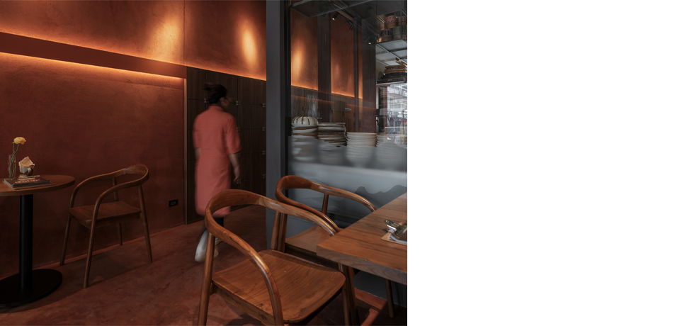
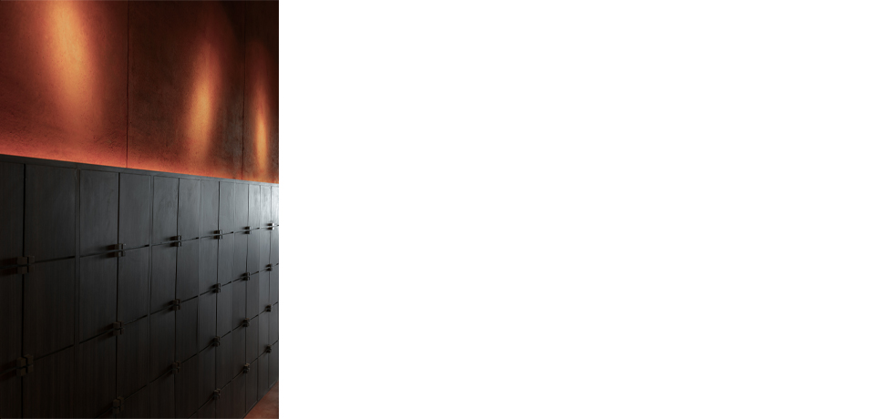
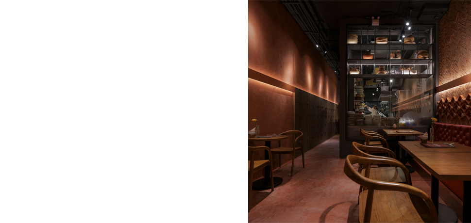
To emphasize natural materials, the designer initially proposed using red local soil plaster for its rich color and texture. However, due to durability concerns,
a sturdier red-colored plaster was applied instead. Walls and floors feature varied plaster textures, with straw mixed into the wall surfaces to create a tactile,
natural feel.
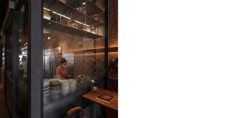
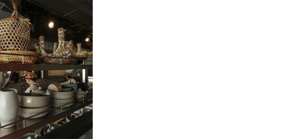
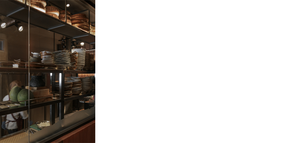
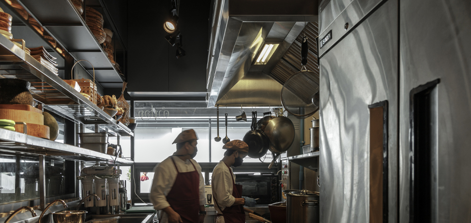
Though compact, the kitchen space was carefully designed to accommodate the many ingredients required for northern Thai cuisine. It is enclosed by
glass walls, reducing the chef’s isolation while allowing customers to observe the preparation process. Traditional utensils are displayed above the kitchen,
while patterned stickers inspired by the northern Thai mountains were applied to areas prone to cooking splashes. These details not only keep the kitchen
visually appealing but also reinforce the connection between flavor, culture, and place.
Architect: Narucha Kuwattanapasiri, Kunatip Thonglueang, Warakorn Charoenrat, Nada Mondee
Interior Architects: Narucha Kuwattanapasiri, Nada Mondee
Landscape Architect: –
Lighting Architect: Lundi Light Design Co., Ltd.
Structural Engineer: –
System Engineers: Sutida Sirimungkla, Tanakorn Eaksongkiat, Rawiwan Tiwawong
Contractor: Look Good Interior Design Co., Ltd.
Photograph: Soopakorn Srisakul